I might just hate the 2026 Color of the Year

I’m late to the Pantone Color of the Year party, but I have a good reason.
Let me start with a little backstory.
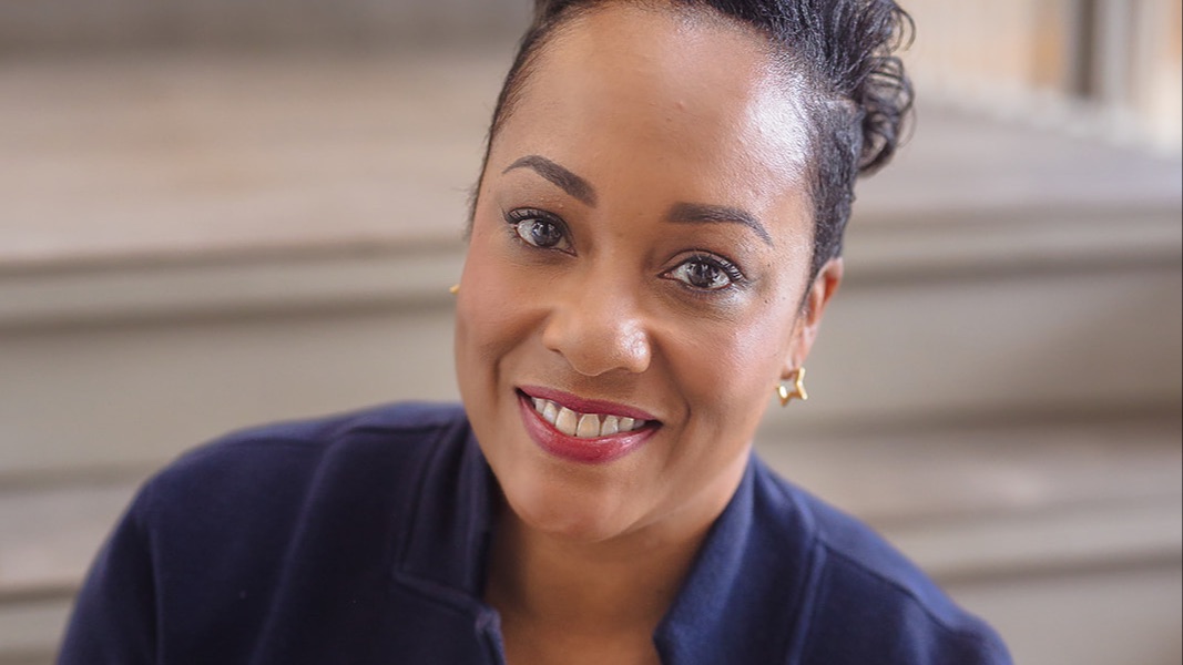
Since 2011, I’ve been a Certified Color Consultant and beyond just a certification, I’ve loved and learned about the history and nuances of color since my teens.
My first business as a beauty consultant in 1998 got me started with color. My favourite thing to teach was color cosmetic application. After seeing thousands of faces in color drapings, make up lessons and beauty applications, I know I’ve got many more than the 10,000 hours “they” say it takes to become an expert at color and how it works on and in people’s lives.
As my Hue and Style® mentorship business grew, and more and more of my clients were learning to use their custom palettes’ color psychology for influence on their audiences, I started to offer my expertise and insight on The Color of the Year when Pantone, “the color authority,” would release it. I started this in 2017.
This is the year I stop. Pantone has chosen a white called Cloud Dancer as its color of the year.
Come inside my color expert brain for a moment.
Color is defined not just by art but by physics and chemistry, too.
And if you’ve ever gone down the rabbit hole of “Is white a color?” you would have found out that it’s not as straightforward as a paint swatch.
White sits in a strange little debate club:
-
In physics (light theory), white is a color — the presence of all wavelengths.
-
In art and pigment theory, white is not a color — it’s what you get when nothing has been added.
-
In design and psychology, white absolutely functions as a color — carrying meaning, mood, symbolism, and emotional response.
In other words… white is both.
And neither.
And also more than we give it credit for.
Which brings me back to Pantone.
So, do I hate the color of the year? No.
I don’t think choosing white as a Color of the Year is not “wrong” from a color psychology stand-point, it does carry symbolism.
I just see it as incomplete. White is most meaningful when it has context and when it reflects something intentional, not when it’s assigned meaning from the outside and handed to the rest of us to adopt.
And maybe that’s why everyone seems to be such in a tizzy over the choice - because if you notice, people are applying their own context to it from everything from racial inequality statements to conflicts in scientific color theory.
So that’s why this year, I’m bowing out of the Pantone color report chatter. Like many of the women I serve the loudness of option and internet hot takes are the distractions that pull us away from finding our own meaning in our style, style of life and brand of leadership. And so we let it go.
Plus, for years and over my entire almost thirty year career in women’s confidence, watched women look to external authorities in style, in success, in self-worth, to tell them who to be, how to show up, and even what color should define their year.
But in my world?
The most powerful colors are the ones you choose from your own palette after you get deeply aligned with your truth.
I’m doing something different.
A little more story time:
Every November, inside my SuccessStyling advanced mentorship community, we go through a process of defining our new year intentions across four pillars:
your confidence & wellbeing,
your supportive relationships,
your meaningful work,
and your community impact.
Once those intentions are clear, we find power in making new choices and directions that make us feel so good, and it works! Women in this group have gained greater happiness, fulfillment, and satisfaction year over year through my process.
So, in light of all this Pantone controversy, I’m going to take this exercise one step further and select a color from my Hue and Style® Color Power Palette that communicates the energy I want to embody, born from my personal intentions. (Women of SuccessStyling, you can add this to your intentions work too!)
And I’m going to encourage my people to do the same.
That way, color becomes personal. Your Color of the Year.
Not Pantone’s.
Not the internet’s.
Not culture’s.
Yours.
So while Pantone’s White, Cloud Dancer, floats around the design world this year, I’ll be choosing something far more personal, far more powerful, and far more aligned.
And yes — I’ve already picked mine.
Stay tuned.
I’ll reveal it soon…
Until next time, keep shifting, keep growing, and keep showing up,
~ 𝕄ℂ𝔾
Begin your journey with me or Explore coming back to mentorship